P4: Create the media components to be used in the planned campaign
Magazine Advert:
I began by creating the magazine component of this campaign. This is because it is purely visual, and allowed me to create the brand identity for the cross-media campaign. I create this brand identity through the green, brown and black colour scheme, which reflects the "Environmental" aims of the product, as well as creating association between those colours and the brand.
Here is the magazine component of this campaign:
Here is the magazine component of this campaign:
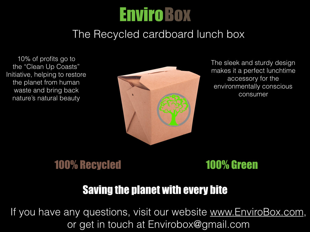
Another way in which I create brand identity here is through the logo, which appears in the middle of the advert, and the slogan "100% Recycled, 100% green, saving the planet with every bite." This slogan can be used across the other components of this campaign to create a consistent and strong campaign.
Audio-Visual Advertisement:
Following the storyboard that I created in pre-production, I began filming of the audio-visual component to this advertisement campaign. Overall filming went very smoothly and I managed to follow the storyboard very easily.
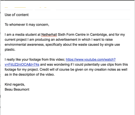
For the "Landfill" shots that I wanted, I unfortunately couldn't film them myself as I had no means of transport to a landfill to record. So for this purpose I sourced some footage that I found on youtube at this link; https://www.youtube.com/watch?v=FijUZ2niOCA&t=74s
As I didn't want to get in trouble with the owner of this footage, I reached out to them asking for permission to use the footage. Here is my interaction with them;
|
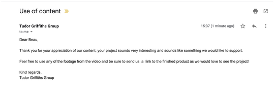
To the left is the email I sent to the content publisher and above is the email response I received back. The group were very happy for me to use the footage for this project so long as I credited them in the description of the Youtube video.
|
Having gathered all of my footage for this project, I needed to focus on sound elements. The first sound elements that i gathered were the music tracks that I linked in P3. I sent out similar emails to the above ones to the publishers of the tracks and gained received emails back outlining that I could use the tracks for this project if credit was given in the description of the video.
Having gained permissions for the intended music tracks, the only production material left to produce was the scripted voiceover. For this purpose, I had a simple set up of a microphone plugged in to my laptop inside of the Netherhall sound studio. The use of a microphone allowed for the audio recorded to be of a high quality, and the sound studio has sound absorbing material to stop sounds from outside bleeding in and to reduce room echo.
I recorded the audio directly into adobe audition and then exported it into final cut pro x along with the other footage and music for the editing process.
I recorded the audio directly into adobe audition and then exported it into final cut pro x along with the other footage and music for the editing process.
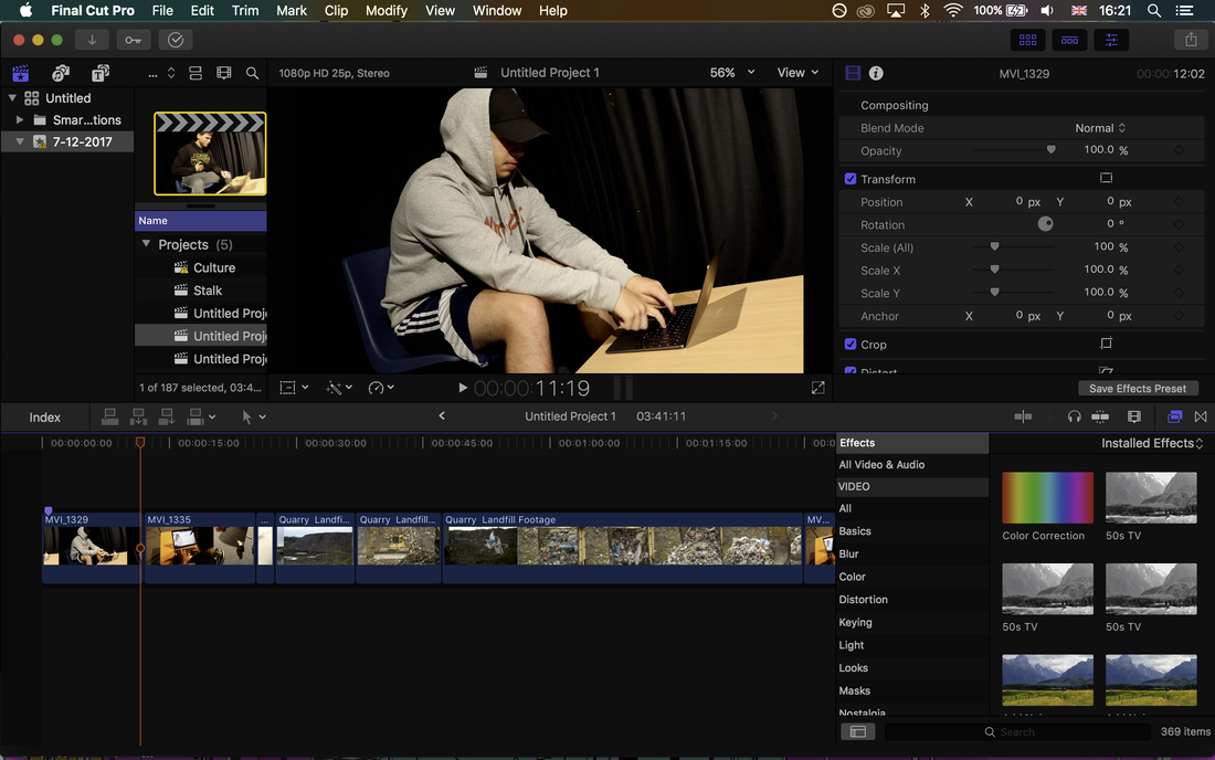
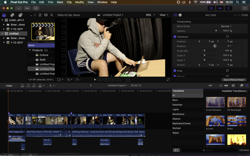
I began the editing process by dragging the imported footage into the Logic Pro X project timeline and cutting the shots down to the desired length and order. This is the basic skeleton for my video filled out and works well as an offline edit that will give an idea of what the finished product will look like in a more stripped back manor. Here is the offline edit I have produced;
|
|
Following this, I carried out further editing processes in order to produce the final advertisement.
Firstly, I added transitions. These transitions make certain shots flow into each other smoothly, or give dramatic effect. The main transitions I used were cross dissolve and fade to black. The cross dissolve transitions allow shots to seemlessly flow into each other, which I used to link the close up of the cigarette on the floor to the landfill sequence. This links the two and pushes the "Environmental" issues caused that the product will later be introduced to solve.
I also used a static transition into the rewind sequence as it is quite jarring and pairs with the rewind to connote to the audience that it is a video being "Rewound."
I then added a visual filter to the landfill scene to make it appear less colourful and connote to the audience that it is "Dull" and "Sad." This was done simply by dragging the "50s TV" effect from Logic Pro X's library onto the clip.
I also added some "Smoke" effects to the cigarette shots. I did this simply by dragging the "Smoke" effects over the clip of the cigarette which added smoke to the scene, making the cigarette look more realistic and connoting that it is polluting the air.
I then added a still card at the end with the Envirobox product, logo, slogan etc. This creates brand identity and keeps the campaign consistent across cross-media components.
I then added a still card at the end with the Envirobox product, logo, slogan etc. This creates brand identity and keeps the campaign consistent across cross-media components.
I then added music and voiceover simply by dragging the audio clips into the timeline and trimming them to fit the sequences. Here is my finished timeline and advertisement:
|
|
Flyer:
This is the final element of my cross media advertising campaign to meet the client brief, the flyer:
Enviro Box by Beau Beaumont on Scribd
To keep the campaign consistent, the green, brown and black colour scheme of the magazine and audio-visual campaign is retained. The slogan and logo are also retained and displayed on the very front of the flyer to catch the attention of audiences and to keep the branding in consumers minds.
Much like the magazine advert, this element of the campaign is purely visual, but as it is a flyer it has room to contain more information about the brand and product itself. The paragraphs are more detailed and there is information about all of the key aspects of the product, charity and brand goals. These paragraphs alternate colours to keep them visually interesting and are concise to retain audience attention.
Much like the magazine advert, this element of the campaign is purely visual, but as it is a flyer it has room to contain more information about the brand and product itself. The paragraphs are more detailed and there is information about all of the key aspects of the product, charity and brand goals. These paragraphs alternate colours to keep them visually interesting and are concise to retain audience attention.
M3: Explain how the required codes and conventions have been met when creating your media advertising components
From my research into advertisements early on in this process I have discovered several key codes and conventions of product advertisement campaigns that I have taken on board and met within this production.
One such convention is the use of a consistent colour scheme. This is a key convention of cross media campaigns, and can be observed in my previous research, such as my research into the skittles advertisement campaign. From this I discovered that utilising a consistent colour scheme throughout all of the components of a campaign is a key factor in creating strong brand identity and as such strong brand awareness within audiences. For example, the skittles advertising campaign always features the "Rainbow" colour scheme behind the letters accompanied by white colouring of the letters themselves. This is done consistently throughout print and audio visual components. Here I have met this convention by utilising a consistent colour scheme throughout my campaign. This colour scheme consists of a black background as well as green and brown text. The logo has also been designed to incorporate the "green" of the colour scheme with the box itself being "brown." these colours represent the environmental aspects of the campaign, and most importantly remain consistent throughout.
Another convention that ties in to this one is the use of consistent slogans and logos. The logo itself along with the image of the box and colouration/font of the product name remains consistent throughout the campaign. This can also be seen in the 'Skittles' campaign with the consistent use of the brand imagery of a packet of skittles beneath rainbow text with the slogan "Taste the rainbow." I have utilised this approach in my campaign by keeping the slogans of "100% recycled, 100% green." and "Saving the planet with every bite." consistent throughout all of the components of the campaign, as well as keeping the logo consistent in terms of use and positioning.
In terms of the television advertisement, I utilised the conventions that I had identified in the P3 task when looking at similar products. A key convention that I met from this research was the conventional use of "voiceover." Much like many other conventional product advertisements, I utilised a voiceover as this helps to convey the message and ideas behind the product whilst still allowing for interesting visuals. In particularly, I noticed that many advertisements such as the 'Coca-Cola' advert that I analysed in P3 utilised a voiceover that focused on an "Environmental issue" and how the brand and product was trying to resolve this issue and fight against it. This was a good advert to analyse as it has a similar 'environmental' focus to the Envirobox project. I took this convention on board as it seemed like an effective way of advertising a product like this due to the fact that it emphasises the product as a solution to an issue that is going to make a change to the world. I met this convention by writing a script for the voiceover which included emphasised the environmental issues and presented the Envirobox as a solution to this issue, thus making audiences care about the environmental issues and tempting them to buy the product so that they can help the issue to be resolved. This was done through emphasis of the "Clean up Coasts" project that this campaign includes as well as information on the 'recycled' nature of the product.
I also achieved this by including statistics about the issue at hand in the voiceover, which is another convention of advertisements of this nature.
Another convention that I believe was met by this product was the convention of a diverse cast. This is a convention that is utilised a lot in advertisement as it allows for the advertisement to be appealing to many audiences of different ethnicities, genders, religions, etc. by including a diverse cast in the advertisement. This can be seen clearly in the "Adidas" advert that I analysed in P3. As this is a simple advertisement with only a few characters, it was hard to meet this convention as I could not include as much diversity as I wanted to. Perhaps rewriting the script to include a wider variety of characters would be beneficial to the campaigns appeal with wider audiences.
Despite this small cast, I feel I was able to capture some diversity, as I had one Spanish character, one white British character and an American voiceover. This offers some diversity to the cast and helps to appeal to a few audiences. One obvious element of diversity that is missing is in terms of gender, and adding a female character into this advertisement would improve it's appeal drastically. This is something that I would include if I were to rewrite the project.
