P1: analyse an existing advertising campaign
Here I'll go through various advertisement campaigns, and analyse their aims, target audiences, successes and failures:
Advertisement Campaigns by Beau Beaumont on Scribd
From this analysis, I have found that advertisement campaigns that are fun and light hearted such as the kit-kat campaign are quite successful as they easily avoid controversy and ethical issues. I have also learned that campaigns that have a clear "
M1: Evaluate different cross-media advertising campaigns for consistency of message
Having evaluated and compared different advertising campaigns, I will now take a look at how a campaign remains consistent throughout it's various cross media-components.
Skittles "Taste The Rainbow" Campaign:
The skittles advertising campaign is a great example of a consistent advertisement campaign that has remained consistent and effective throughout it's history. The campaign involves humorous and sometimes shocking content always followed by the famous tagline: "Taste the rainbow."
Below are the print based components of this campaign, which were also released on social media;
Below are the print based components of this campaign, which were also released on social media;
|
|
|
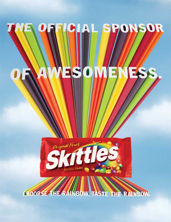
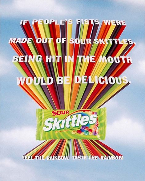
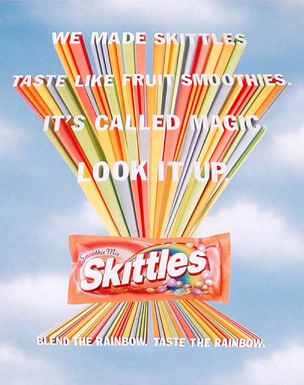
As you can see, these three posters are designed in the same layout, with the product in the middle and rainbow lines shooting out of it into the text. The rainbow lines match the flavours of the candy and create immediate brand identity as skittles whole campaign is about "The Rainbow."
Every poster has different text at the top, which is usually something humorous or shocking to catch the attention of audiences. The text being at the top means that it is the first thing that audiences see when looking at the poster.
The consistency of the campaign can be seen not only in the design and layout of the posters, but also in the bottom text. The bottom text is the famous skittles slogan: "________ THE RAINBOW. TASTE THE RAINBOW." This first part of the slogan changes to relate to the specific poster, adding to the humour. The last part of the slogan and the final thing that audiences read is the consistent slogan for the entire brand. This remains consistent through the entire skittles campaign and links every skittles advert together, creating strong brand identity.
The campaign remains consistent through cross-media component. The previous ads are for print and online, so are consistent through those mediums. This consistency can also be seen within the audio-visual components of the campaign:
|
|
|
The two advertisements above were created for both television and online marketing. They further display the consistency of message within the campaign as a whole. For example, both are sketches involving the product that are intended to be humorous, dark and shocking. For example the man not being able to hold his baby or having killed the man with his skittles touch. The dark humour is consistent with the previous print campaigns such as in the sour skittles one where it talks about if "People's fists were skittles." This dark topics are juxtaposed with the colourful skittles and upbeat voiceover at the end to create humour.
The ending of both campaigns has the same cloudy background as the print campaigns with the same "Taste the rainbow" slogan.
This consistency of message is vitally important in advertising campaigns, as it ties the campaign together and pushes a consistent message and branding. This kind of strong message keeps a brand and product in consumers minds and allows for things such as colour schemes, designs or slogans to immediately make them think of your product.
I will certainly be taking these ideas on board for my campaign.
